Customer Services
Copyright © 2025 Desertcart Holdings Limited


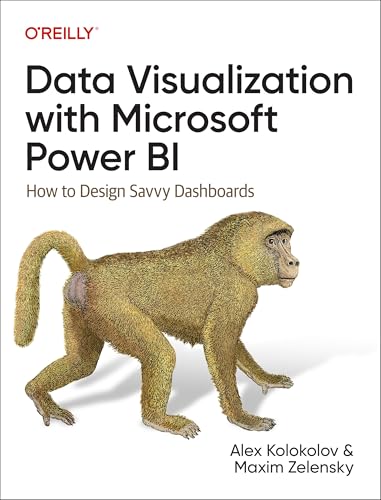
Data Visualization With Microsoft Power Bi : Kolokolov, Alex, Zelensky, Maxim: desertcart.in: Books Review: Go for it - I was searching for a Power BI book for so long. And I found this book. Those detailed images and highlighted images made this book easy to understand. Someone with keen knowledge in this field could only make these kinds of books with presentations and charts. Review: A must have book - This book by Alex Kolokolov is a must have for all Power BI enthusiasts. I would really recommend this if you are someone looking to gain further knowledge on Power BI.


| Best Sellers Rank | #116 in C Programming Language #242 in Microsoft Programming |
| Customer Reviews | 4.4 4.4 out of 5 stars (44) |
| Dimensions | 17.78 x 2.16 x 23.34 cm |
| ISBN-10 | 1098152786 |
| ISBN-13 | 978-1098152789 |
| Importer | Atlantic Publishers and Distributors (P) Ltd., 7/22, Ansari Road, Darya Ganj, New Delhi - 110002 INDIA, Email – [email protected], Ph – 011-47320500 |
| Item Weight | 732 g |
| Language | English |
| Print length | 413 pages |
| Publication date | 29 October 2024 |
| Publisher | Oreilly & Associates Inc |
A**H
Go for it
I was searching for a Power BI book for so long. And I found this book. Those detailed images and highlighted images made this book easy to understand. Someone with keen knowledge in this field could only make these kinds of books with presentations and charts.
A**S
A must have book
This book by Alex Kolokolov is a must have for all Power BI enthusiasts. I would really recommend this if you are someone looking to gain further knowledge on Power BI.
P**G
A Must-Read for Beginners in Power BI
This book serves as an excellent guide for beginners navigating their way through Power BI. The authors simplify complex topics, making them easy to grasp even for those with no technical background. It covers a broad range of subjects, from basic charting to more advanced visual designs, offering practical tips and best practices for business reporting along the way. I especially appreciated the clear guidance on avoiding common mistakes in data visualization. If you are new to Power BI, this book is highly recommended!
B**A
Must learn a great guidance from alex
A must visit & grabbing learning book to make yourearning way of power bi more better with great contents visualization
N**A
A must-read for Power BI users: From Basics to Advanced Data Visualization
“Data Visualization with Microsoft Power BI” book serves as a comprehensive guide for anyone looking to enhance their Power BI skills, from beginners to advanced users. The basics section offers an easy introduction with familiar charts like bar and line charts for those just starting out. For more experienced users seeking complexity, the later chapters provide insights into advanced visualizations, including AI-driven charts such as scatter plots, waterfall charts, and decomposition trees. One of the book's strongest elements is its emphasis on the importance of classic charts. These charts are not only easy to understand and interpret, but they can often convey insights just as effectively as more advanced visualizations. The message from Alex and Maxim is clear: you don’t always need complex charts if the classics can communicate the results effectively. The Chart Anatomy section is particularly valuable for beginners, as it breaks down essential chart components—such as the Y-axis, X-axis, legends, data labels, and more—into an accessible format. What truly stood out for me was the Chart Chooser Diagram, or "Visualization Compass." It’s an excellent resource, acting as a cheat sheet for anyone unsure of which chart best fits their data. The Tips and Notes sections at the end of each chapter are also highly useful, offering concise summaries of key points. A unique feature of this book is its combination of Data Analytics and AI-driven visualizations, which sets it apart from other resources. I was particularly intrigued by the lesser-known advanced charts like hexbin charts, decomposition trees, and bullet charts, which provide innovative ways to represent complex data. The advanced sections also delve into multitarget and dynamic KPI cards, offering insights that will captivate any data enthusiast. With a step-by-step guide on building dashboards using grid layouts and a quiz section to test your understanding, no doubt this book eliminates the need for physical classroom training for Power BI. It builds confidence, ensuring proficiency in both basic and advanced data visualization techniques. In summary, this book is a must-read for anyone eager to master both foundational and cutting-edge data visualization methods.
N**U
Ok
D**T
As a Business Intelligence Analyst and Power BI Developer, I have read numerous books on data visualization and dashboard design, but Data Visualization with Microsoft Power BI: How to Design Savvy Dashboards by Alex Kolokolov and Maxim Zelensky truly stands out. This book is a comprehensive guide that perfectly balances theoretical principles and practical techniques, making it invaluable for anyone looking to elevate their Power BI skills. What sets this book apart is its emphasis on design thinking and storytelling, two often-overlooked aspects of dashboard creation. The authors go beyond just teaching technical features of Power BI. They delve into how to craft dashboards that communicate insights effectively while maintaining a professional and visually appealing design. The content is well-organized, with clear explanations and practical examples that demonstrate the concepts in action. The book includes actionable advice on choosing the right charts, optimizing layouts, and leveraging Power BI’s advanced features to create dashboards that not only look great but also drive better decision-making. As someone who works with data daily, I particularly appreciated the focus on usability and user experience. The authors stress the importance of understanding your audience and tailoring dashboards to their needs, which is critical for delivering real value through data visualization. Their guidance on how to avoid common pitfalls in dashboard design is also incredibly useful. This book is not just for Power BI users; it’s a valuable resource for any professional involved in data storytelling or dashboard design. Whether you’re an analyst, a developer, or a manager, the lessons and principles outlined here will improve how you present and share data insights. A big thank you to Alex Kolokolov and Maxim Zelensky for creating such a thorough, engaging, and practical resource. This book has become a permanent addition to my professional library, and I would highly recommend it to anyone who wants to take their data visualization skills to the next level. Five stars, without hesitation!
I**D
Kolokolov and Zelensky's "Data Visualization with Microsoft Power BI: How to Design Savvy Dashboards" is a must-read for anyone looking to unlock the storytelling power of data. This book provides a comprehensive overview of chart types, from the familiar line chart to the more intricate chord diagram. But what sets it apart is its insightful guidance on chart selection, ensuring you always choose the most effective visual for your message. The authors excel at demonstrating best practices through real-world examples. By showcasing both effective and ineffective visualizations side-by-side, they provide clear visual cues that highlight common pitfalls and inspire design choices. For instance, I learned why tornado charts are a poor choice for comparing projected vs. actual values - a valuable lesson! Beyond individual charts, the book delves into dashboard design, offering practical advice on element positioning and configuration within Power BI. This makes it an invaluable resource for data analysts and business professionals in finance, sales, and marketing, especially those without coding experience. While the book boasts a companion GitHub repository with sample data, I found the link format somewhat cumbersome. Instead of direct links to file names, the authors use shortened URLs that are case-sensitive and redirect to the repository. Direct GitHub links would improve accessibility. The book's structure, with three sections of increasing chart complexity and challenging quizzes, reinforces learning and encourages deeper understanding. Overall: This book is a fantastic guide to data visualization with Power BI. Its clear explanations, practical examples, and focus on effective design make it a valuable asset for anyone seeking to transform data into compelling visual narratives.
J**H
As an experienced data professional, I found this book to be an invaluable resource. It goes beyond basic Power BI functionality to emphasise the principles of effective data visualisation and dashboard design. The authors strike an excellent balance between theory and practical application, making complex concepts accessible and actionable. Their guidance on creating clear, user-friendly dashboards is spot-on, with real-world examples that enhance understanding. Outside the technicalities, I absolutely love the baboon on the cover. My 6 years old son is super intrigued and curious about the book! Whether you’re new to Power BI or an experienced user, this book is a must-have for anyone aiming to create impactful, insightful dashboards. Highly recommended!
B**Z
Great book
Trustpilot
1 month ago
1 month ago